WHAT ILLUSTRATION STYLE IS RIGHT FOR YOU?

I like to think that when people think of ESM Creative Studio, they think of our integration of illustration into branding. It was one of my favorite things to incorporate if it fits the goals and needs of our clients. Although, I do think illustration adds something special to every project. Especially in our extremely fast-paced and digital society, we pay attention and process pretty pictures way more than just text.
There are a few things to consider when deciding on a direction for illustration style.
Aesthetics
Feeling
Vector vs. Raster
Aesthetics
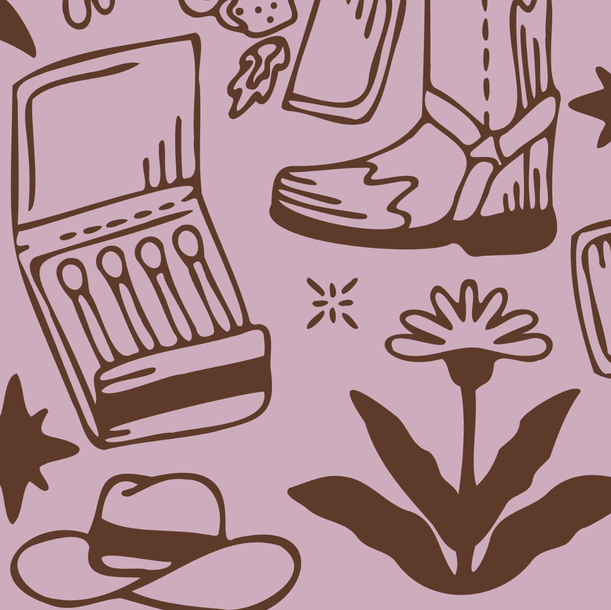
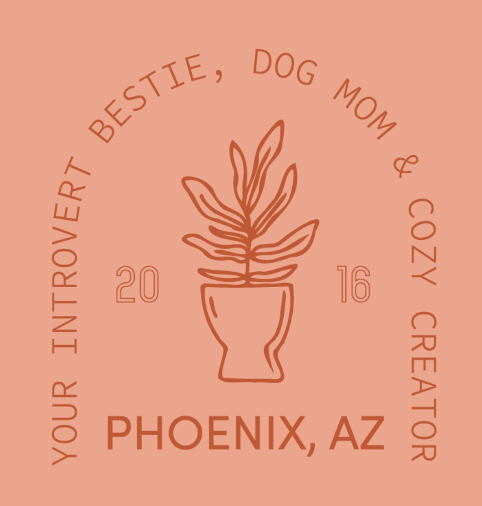
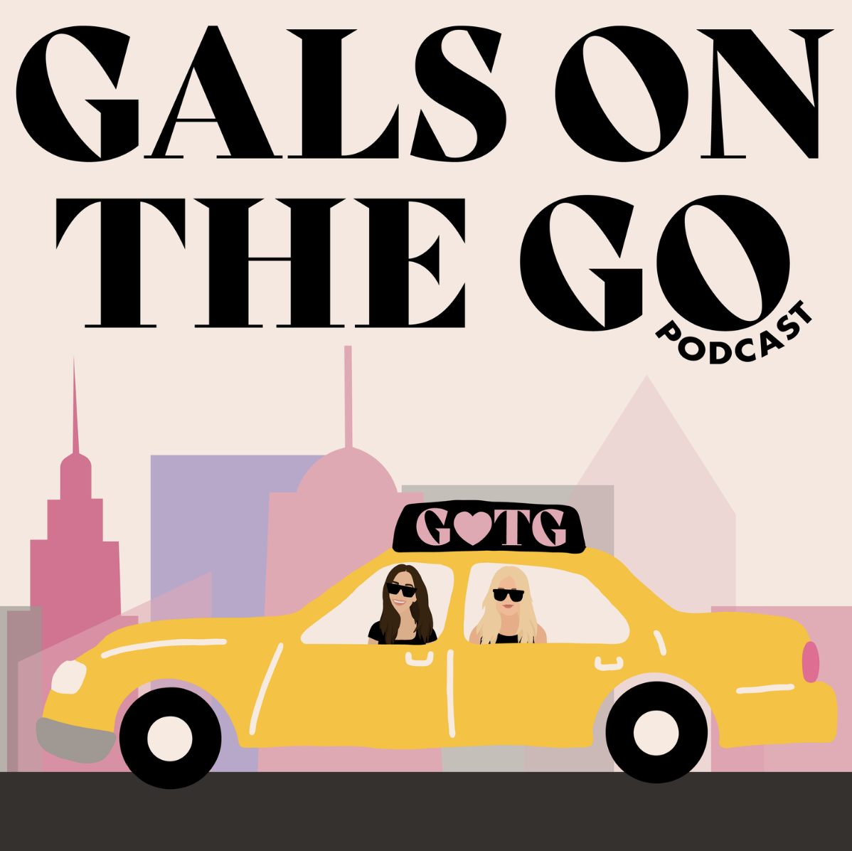
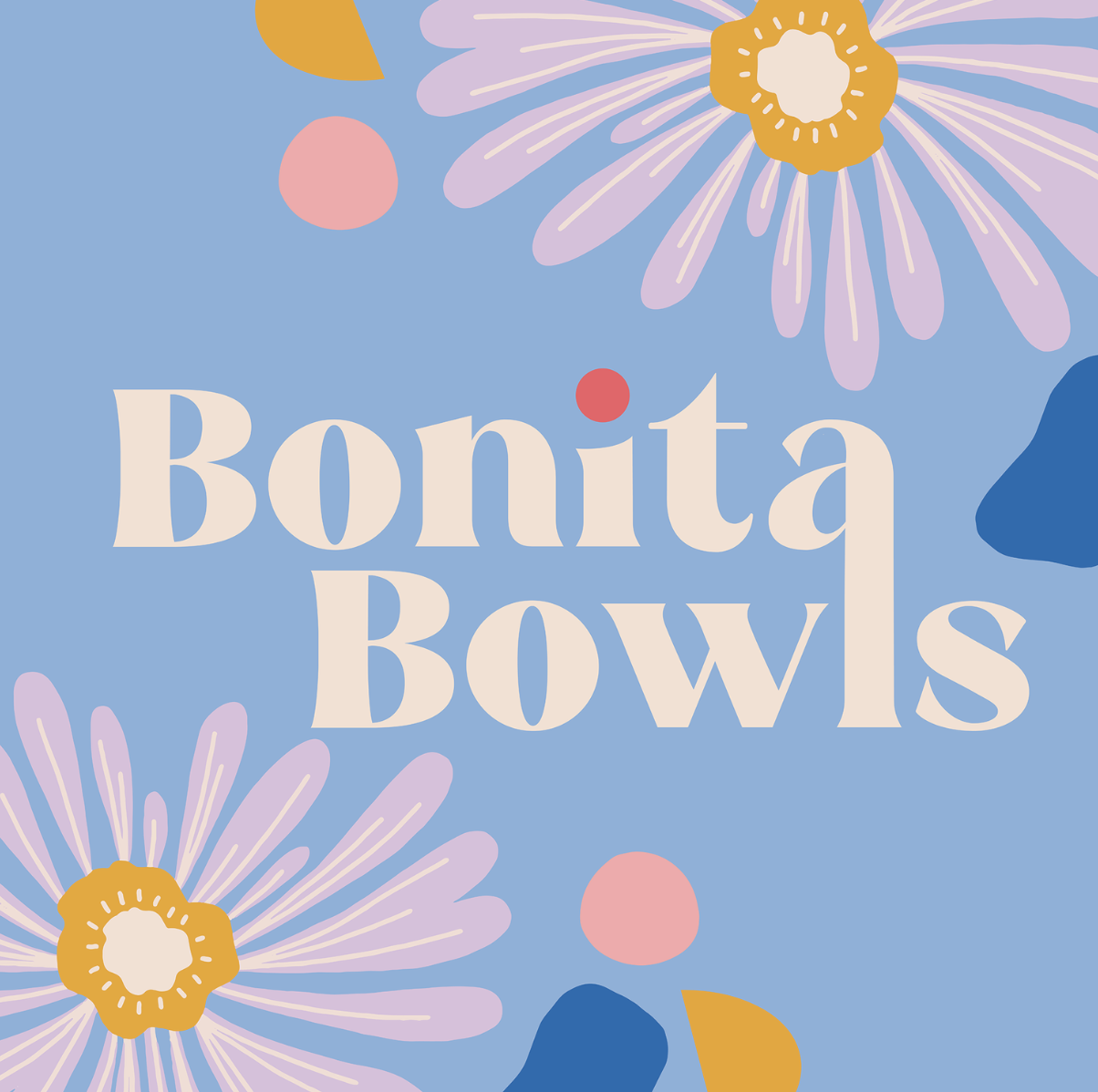
So what are these illustrations going to look like?
Here are a few of my favorite style options (not an exhaustive list, just my preferred choices for my clients):

Feeling
An illustration style helps define the overall tone and feeling conveyed by a brand.
Choosing the right illustration style is an important decision when starting out that can impact a lot within your project and the future of the brand. This is why it is also important to find a designer/illustrator who understands the goals and values of your business.
Here are a few of the factors I like to consider when determining which illustration style is right for a brand:
Purpose and Context — Why are you including illustrations in your branding suite? What feelings do you want to be invoked when people see your branding and the illustrations that accompany it? How do you want people interacting with your band online? How do you want them to feel when they are interacting?
Target Audience — Who are these illustrations for? What age, interests, purchasing habits, cultural background, etc. are these consumers? How will these illustrations affect their buying habits? How will they feel about the brand?
Branding and Consistency — Is this a style of illustration that can grow with the brand? Does the brand have the budget to work with a designer if they need upkeep? Is this illustration style transferable to the mediums this brand uses?
Vector vs. Raster
I feel like as designers we are taught to vectorize, vectorize, vectorize! But for the right client, raster, or pixel-based, illustrations are totally fine. This is something to talk with your designer about and figure out what is right for you. Most clients that I deliver raster illustrations to also receive vector options and a big warning about printing and sizing. Sometimes you just can’t get the same texture and look with a vectorized illustration. For most online/digital businesses, raster illustrations can be a great asset.
So… what is the difference??
Vector: Vector file graphics are more mathematical than pixel images. As you zoom into a vector image or make it bigger, you won’t see pixel squares because the lines and shapes in the image are mapped out mathematically so they will always readjust to keep their original shape. These illustrations are technically infinitely scalable.
Raster: A pixel image is made up of tiny squares that create one larger image. On pixel images, if you zoom in far enough, you can begin to see the square forms within the image, this is what can cause the image to be blurry when expanded or contracted beyond it’s limits. These illustrations are bound by their original size.

LET’S put it all together!!
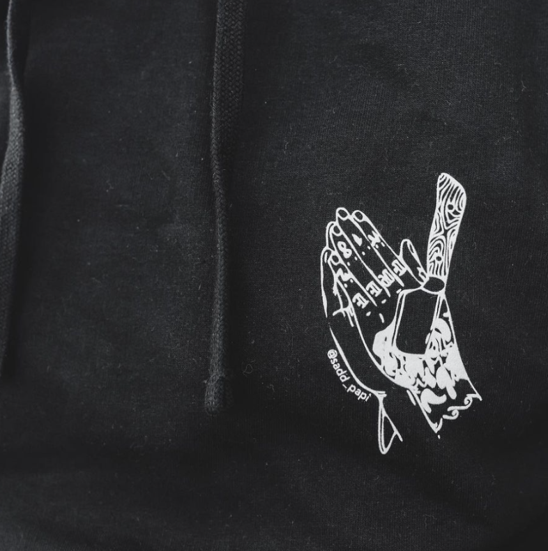
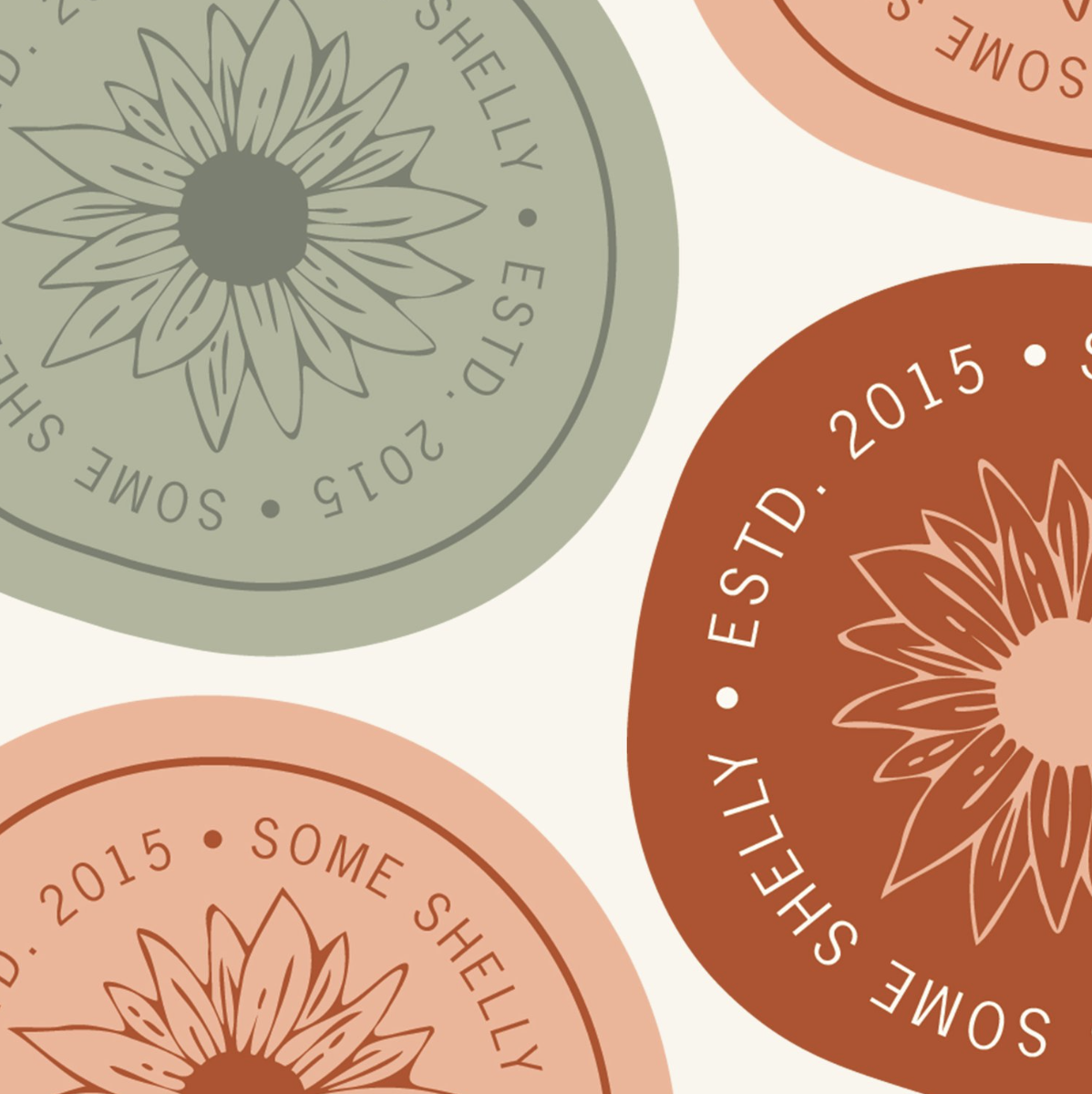
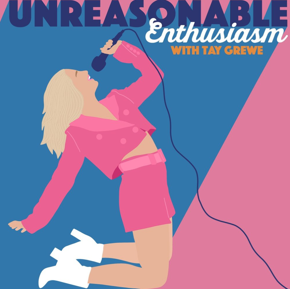
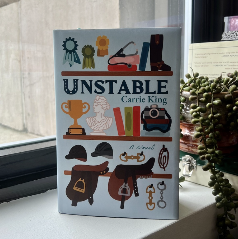
Here are some of my illustration styles and examples from my branding & illustration work: